The AURAMARKET rankings board. A live scoreboard of cultural attention.
The AURAMARKET rankings board. A live scoreboard of cultural attention.
AURAMARKET is a trading platform where the stocks are people. Actors, musicians, athletes, politicians, scientists. Prices move with real-world attention, so when someone goes viral, wins something, or gets cancelled, the market reacts.
I designed it, built it, and run it. It's live at auramarket.io.
"A stock market where the stocks are people."
I'd been watching Polymarket for a while. The thing that fascinated me wasn't the betting, it was the idea that a market could become a more honest read on the world than any single publication. Crowds pricing reality in real time.
I kept thinking: if you can price the outcome of an election, you can price a person. Fame, relevance, cultural weight. These move constantly, they're felt by everyone, and yet there's no scoreboard for them. The closest thing is a Wikipedia pageview chart, and that's not exactly a product.
So I started building one. A market where the asset is a person and the price is their cultural stock, calculated from real signals and traded by a real audience. No real money. Just the game of being right about who's rising and who's fading.
"If you can price the outcome of an election, you can price a person."
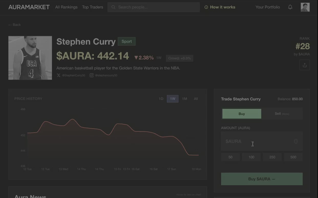
Every user gets a monthly allowance of $AURA, a virtual currency. They use it to buy and sell shares in around 950 public figures across film, music, sport, politics, tech, science, art, and comedy.
Prices are set by an algorithm I designed that ingests Wikipedia pageviews and global news coverage, scores each article for sentiment and cultural magnitude, and produces a daily price between $15 and $1,000. When Rory McIlroy wins the Masters, he goes up. When a tech CEO has a bad week on Twitter, they come down. The market reprices twice a day and reranks the entire board.
The user side is simple. Browse the board, buy who you think is about to pop, sell who you think has peaked, climb the leaderboard. Top traders win prizes at the end of each month.
The thing I'm most proud of isn't the trading game. It's the algorithm. The trading is the delivery mechanism. The real product is a live signal of public attention, and I think there's a serious version of this that PR agencies, talent agencies, and investors would pay for.
Buying shares in a person you think is about to rise.
When your asset is a real person, every design decision carries tone. The product needed to feel fun and playful, but also credible. I wanted people to take the market seriously as a game, not dismiss it as a gossip app.
A few product decisions set the tone early. We call them notable people, not celebrities. Categories are cultural — Film, Music, Science, Art — not tabloid. The visual language borrows from financial publications and editorial magazines: clean typography, data-forward layouts, muted palettes. When a price moves, the UI talks about attention and signal, not hype or popularity.
The roster is curated around people who are genuinely in public life — athletes, actors, politicians, scientists. The frame is always "the market is reading the culture," which keeps it fun without feeling cheap.
The result is something that feels like Bloomberg covering culture. That positioning was a deliberate design choice and it's what makes the product work.
"There's a version of this product that's grim. A leaderboard of human worth dressed up in fintech chrome. I had to design my way out of that."
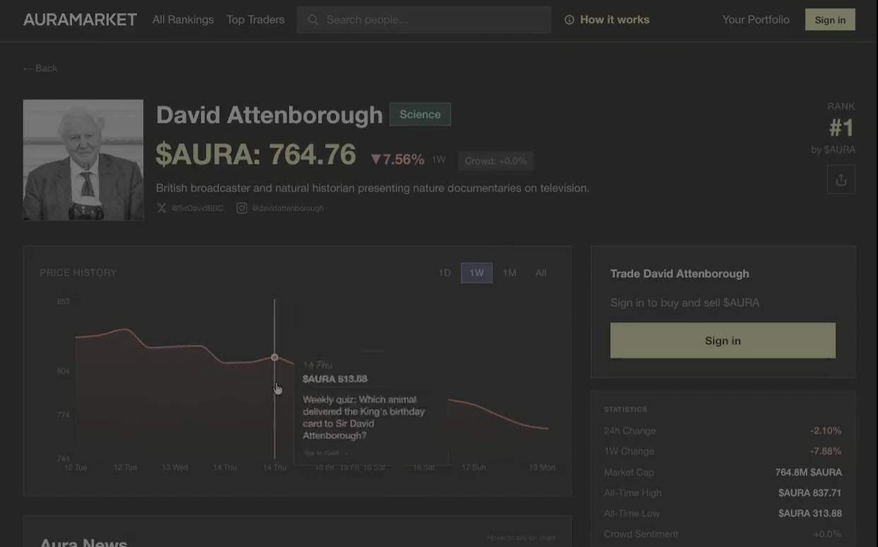
David Attenborough's profile. Editorial tone, no tabloid framing.
Behind every price is a chain of decisions: pageviews on Wikipedia, articles scraped from news feeds, each one scored for sentiment and weighted by how recent it is, then compressed through a log curve and a power curve into a number between $15 and $1,000. It's the kind of thing that's easy to describe in a spec doc and impossible to feel.
The risk was a product that looks magical and feels arbitrary. Prices move, users have no idea why, trust erodes, they leave.
The design move was to never let a price move appear without a reason next to it. Every card carries a status: trending, surging, fading, quiet, moving. Every profile shows the recent articles that fed the price. The How It Works page explains the pipeline in plain English without ever using the word "algorithm" defensively.
The deeper move was harder. The algorithm itself had to be tuned so the visible reasons matched the visible moves. If a card said "surging" but the price had barely budged, the product felt broken. If a price jumped 20% with no visible news, the product felt rigged. A lot of my time has gone into making sure the story the UI tells matches the story the data is telling. That's a design problem disguised as a data problem.
"Making sure the story the UI tells matches the story the data is telling. That's a design problem disguised as a data problem."
The How It Works modal. Explaining the pipeline in plain English.
I wanted the product to feel like something you'd want to look at. Most trading interfaces are loud, cluttered, and designed for people who already know what they're doing. Most pop-culture products are bright, friendly, and designed for engagement.
I went somewhere else. Dark mode, editorial typography, generous spacing, Helvetica Neue, the visual confidence of a financial publication. The reference points were Hypebeast, Bloomberg Businessweek, and the kind of fintech that takes itself seriously.
The hard part wasn't picking the aesthetic. It was holding the line as data density crept in. A rankings page with 950 rows wants to become a spreadsheet. A profile page with a price chart, news feed, and trading panel wants to become a Bloomberg terminal. Every component had to earn its space. The win was the homepage rankings board, which carries a lot of information but reads like a magazine masthead.

The algorithm is the product, the UI is the doorway. I came in thinking I was designing a trading interface. I was actually designing a signal. The interface exists to make the signal feel trustworthy, legible, and worth checking back on. Every design decision I'm proudest of pushed in that direction.
Building solo changes what "good" means. When I'm the only designer, developer, and PM, "good enough to ship" beats "good enough to defend in a critique." I've gotten faster at making decisions that I'd previously have wanted three rounds of feedback on. Some of them are wrong. Most of them are fine. The product moves.
Pricing is a design surface. I used to think pricing was a backend concern. After tuning this algorithm for months, I think pricing is the most visible part of the product. The numbers on the cards are the typography, the copy, and the brand all at once. If they're wrong, nothing else matters.
Distribution is harder than the product. Building it was the easy part. Getting the right first thousand people to care is the part I'm still figuring out.
"I came in thinking I was designing a trading interface. I was actually designing a signal."
AURAMARKET is live at auramarket.io with around 950 notable people on the board and real users trading. The pricing engine is on version 5, with each version a response to something real I've seen on the market.
What's next: a proper public launch around a cultural moment big enough to introduce the product on its own terms. Better tooling for the data side, because I think there's a real business in licensing the signal to people who care about cultural attention professionally. And eventually, a way to let users vote new people onto the board, so the roster grows the way the audience wants it to.
It started as an experiment. It's becoming something I take seriously.