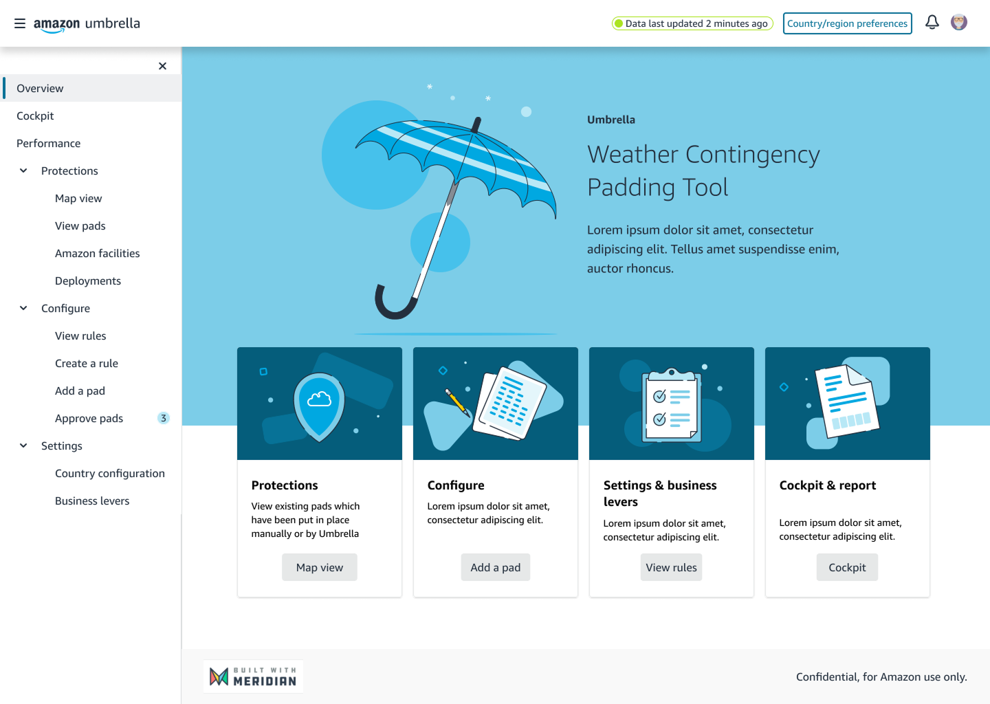
The Umbrella homepage: a single entry point for weather contingency across Amazon's global network.
When a storm is coming, Amazon extends delivery promises before the network slips, using what it calls a promise pad. Umbrella is the platform that decides where those pads land, prices what each one costs, and has to explain a model's decision to the person who gets asked about it.
The Umbrella homepage: a single entry point for weather contingency across Amazon's global network.
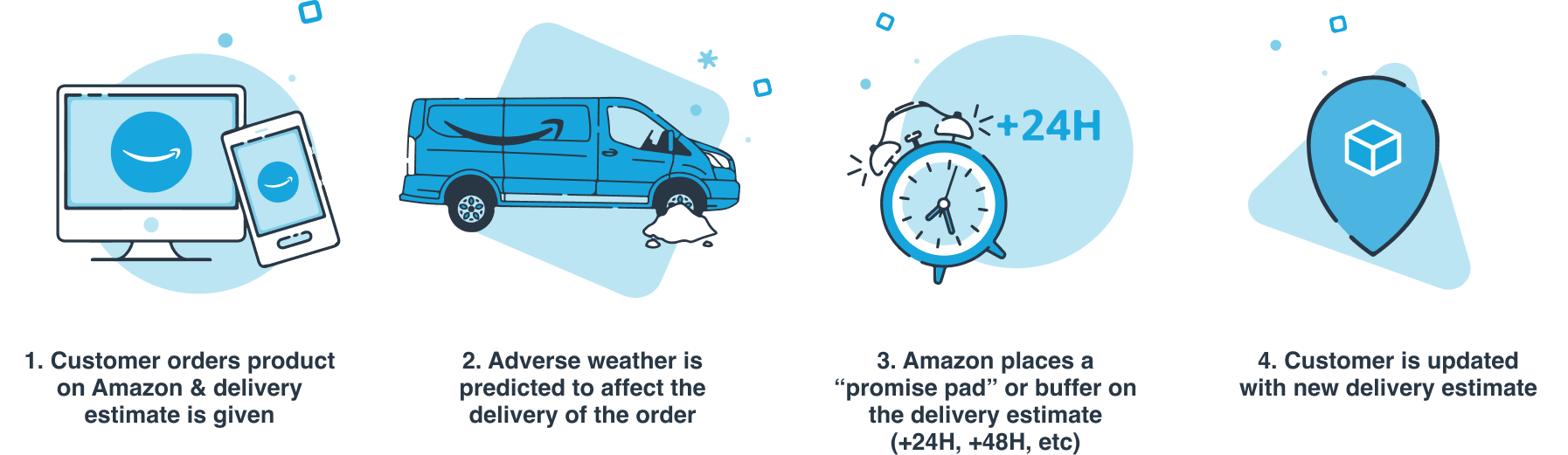
Amazon measures Delivery Estimate Accuracy as the percentage of packages that arrive when the customer was told they would. Accuracy is not speed. If I tell you Thursday and it arrives Friday, that is a miss. If I tell you on Wednesday that it is now Friday, that is accurate. The promise can move. It just has to move before it expires.
When a storm is coming, the way to protect accuracy is to add time to delivery promises before the network slips. That is a promise pad, and it is a purchase: you spend speed to buy accuracy, and someone's targets pay for it.
Across North America and Europe, weather padding had grown up locally. Each operation had its own tools, its own thresholds and its own definition of a bad day. None of them could see the others, and nobody could say what was happening across the network without assembling it by hand.
A tool called Tramontane used a forecasting model to place pads automatically. Fast, and almost impossible for the people affected to argue with.
A separate system with its own rulebook and its own severity thresholds, built independently, with far less automation.
Within North America, Canada had nothing. Every pad was worked out and placed by hand, event after event.
I ran research across the three groups who would use Umbrella, starting with a week-long workshop in Seattle with operations teams from both regions, mapping how each one actually handled an event.
Four findings came back. Every decision below traces to one of them.
Before designing, I baselined the tools with the System Usability Scale. Tramontane scored 58: the strongest of the estate, and operators genuinely liked seeing pads placed on a map of the US, but it only covered snow and nobody could explain its reasoning upward. Europe's rulebook system scored 47, dragged down by being retrospective by design. Canada had nothing to score at all: every pad was worked out by hand in spreadsheets, so there was no tool to put in front of a user. The industry average is 68; neither tool came close.
The map is the one thing I'd keep: you can see the pads land across the US. But it only speaks snow, and when a wind event hits, or leadership asks why a pad exists, I'm on my own.
By the time the system speaks, the storm has been and gone. We are always reading last week's answer.
Every event is a night of copy and paste. One typo in a postcode and the wrong city gets padded.
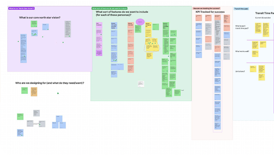
A week in Seattle mapping how each region actually handled an event.
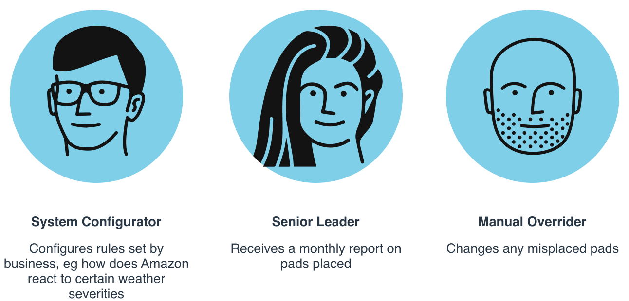
Depth, breadth and speed, competing for the same screen.
Every decision below was argued against these four. One of them I knowingly broke: the review step in decision four makes Umbrella higher touch than tenet two allows, and I would still do it.
Each of these came out of one of the findings above. For every one I have tried to name the option I did not take, and what choosing the other one cost us, because that second part is usually the bit that goes missing.
Giving each group its own view tested beautifully with each group alone. It fell apart in the situation that actually matters: a leader asking an operator why a pad is there, with two different products in front of them and nothing in common to point at.
So everyone gets the same structure and moves down a level when they need more. The cockpit answers the leader's question, protections sits under it for the people doing the work, configuration under that for the people writing rules.
I chose one shared product over three tailored ones. It cost the leaders simplicity: their view carries a route into depth they will never personally use, and I would not hide it, because the moment they ask why, they need to be able to walk down there with someone.
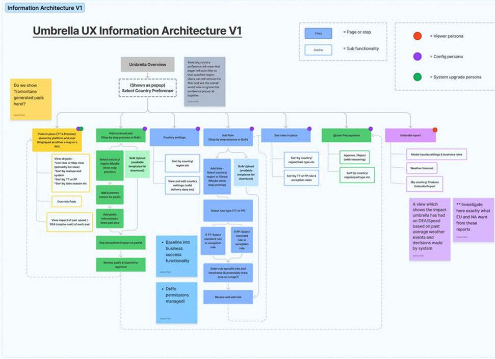
One structure at three depths, rather than three products.
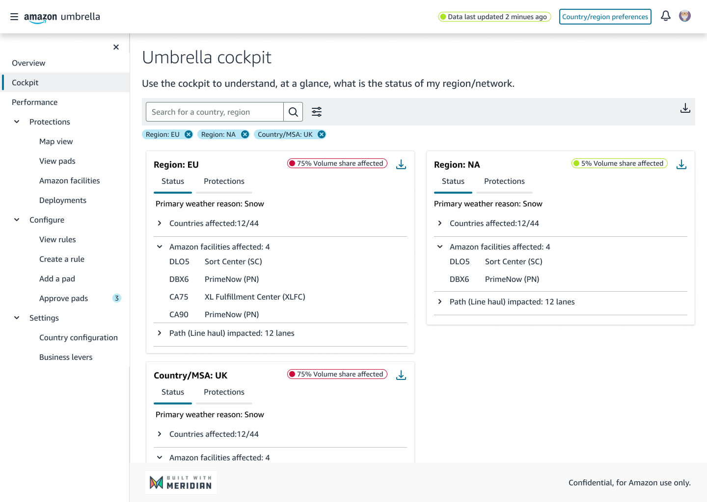
The cockpit: the leader's question, answered without anyone compiling it.
The second finding was the sharpest: automation people cannot overrule is worse than no automation. The obvious build is to let the system place pads and notify you, with the rules tucked away somewhere in settings. That is the calmest design on an ordinary day and the worst one during a storm.
So pads the system placed and pads people placed live in one list, with the same controls on both.
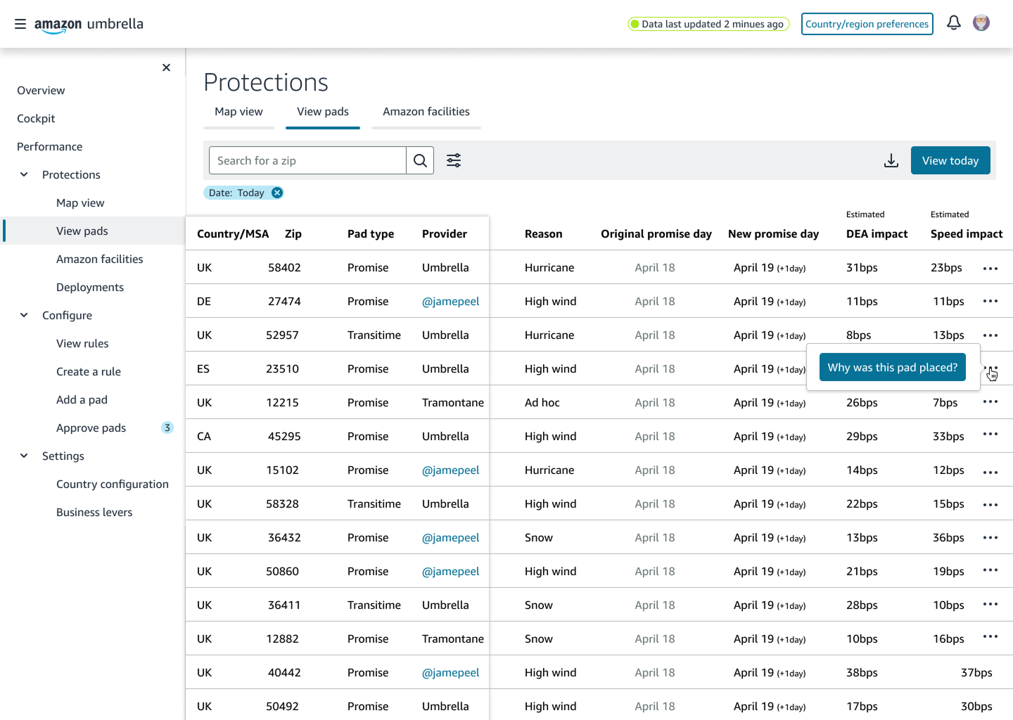
A single column tells you whether the system or a person placed a pad. Everything else about the row is identical, so nobody has to learn two mental models.
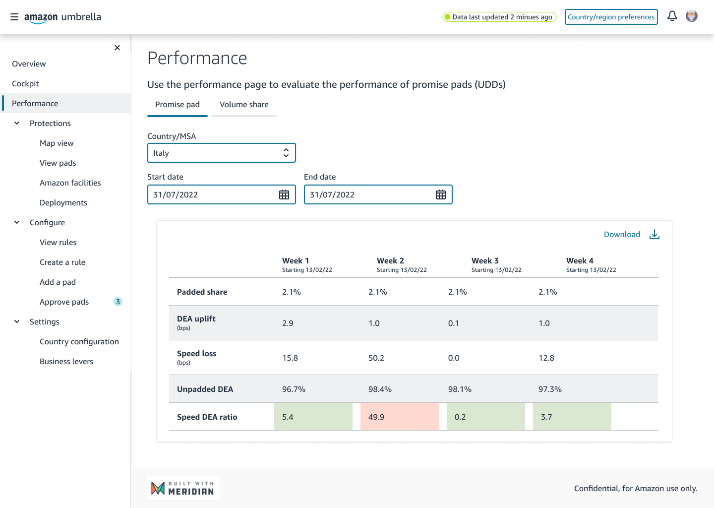
Accuracy and speed impact sit side by side. A pad that reports what it protects but not what it spends hides half the decision.
The explanation is an action on the pad itself rather than a separate audit screen, so it is reachable at the moment somebody asks.
I chose to keep the override next to the result. It cost safety: there is a Remove rule button inside a panel people open in the middle of a storm, and I have never been comfortable with how easy I made that.
People were being asked to defend a decision they did not make and could not see. Underneath that sits a real mismatch: operators are accountable for postcodes and delivery areas, while the forecasting model works in its own weather regions, drawn for meteorology, which cut straight across the areas people manage.
A friendly summary would have been kinder to read and would have quietly gone out of date the first time the model was retrained.
The two maps meet at one point. People answer for the left one and can only watch the right one.
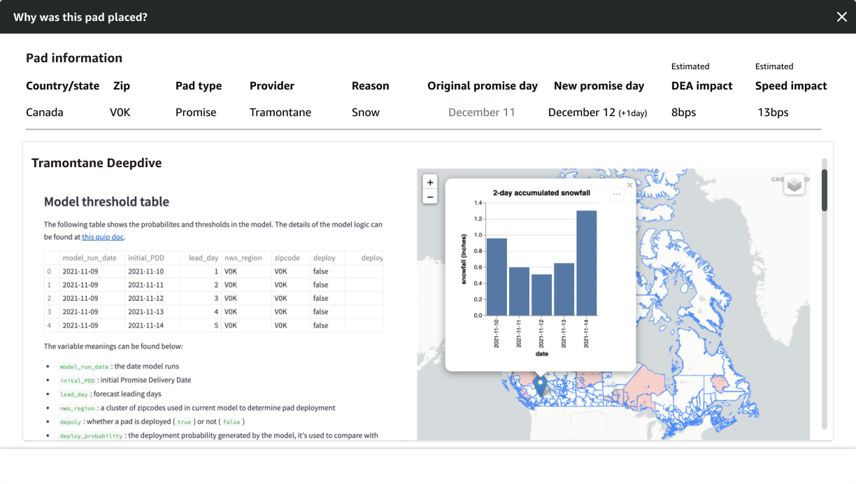
Shown as the model produces them, so the panel cannot drift out of step with the thing it is describing.
Every term explained in plain language in the same view. The translation happens where the reader is, not in a document they will never open.
The chart and map are there so somebody who does not want to read a table can still see the weather that caused this.
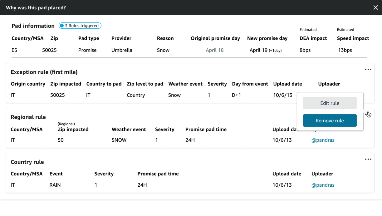
Where several rules combine into one pad, the same panel lists all of them in order, and each stays editable from here.
I chose honesty over friendliness. It cost first-time readability: the panel needs its glossary to be understood, which makes it hardest on exactly the person opening it for the first time, mid-event, with someone waiting.
The fourth finding was that the trade between accuracy and speed was happening constantly, in people's heads, with no feedback. Reporting it afterwards in a performance view keeps it exactly as invisible as the research found it.
So every pad, placed one at a time or hundreds at once, shows its estimated effect on both before it is submitted, and then goes to a named approver.
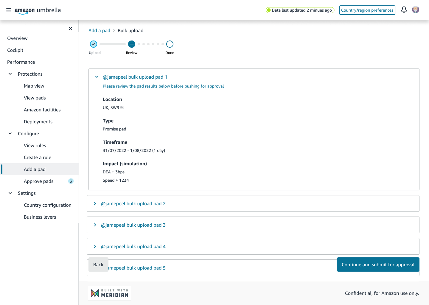
Bulk uploads expand into individual pads before submission, so hundreds of decisions cannot pass as one.
Both sides of the trade shown at the moment somebody can still change their mind about it.
The button says what actually happens next. A named person approves it, which is the part that cost us speed.
I chose to put a review step and a human approval into the fastest task in the product. It cost speed at exactly the moment speed matters, and it cost me my own tenet that Umbrella should be low touch. I would still do it, because the alternative is one person spending another region's speed with nobody agreeing to it.
A pad is one object, but the urgency around it varies enormously. Setting up a rule before a season is considered work. Loading a file someone prepared is administrative. Placing forty pads because a storm is tracking towards the Midlands is neither.
Three entry points, one product: a form for precision, a file for volume, a shape drawn onto the map for speed. All three land on the same review step and enter the same queue.
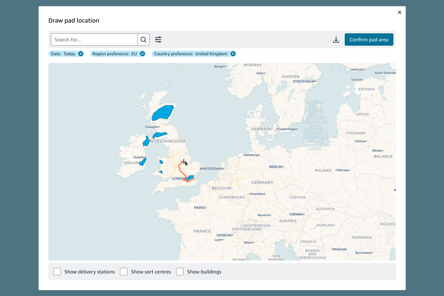
Mid-event, people think in the shape of the storm. The system resolves that shape back into the areas it understands, which moves the translation off the person.
Toggles for delivery stations and sort centres, so the consequence of a shape is visible while it is still a shape.
The drawn area lands on the same review and approval steps as every other route in. Speed changes the input, never the safeguards.
The wireframes carried the arguments about columns, density and what belongs on a row, and the shipped screens are recognisably the same tables. Two things changed, and both came out of the research: accuracy and speed became two columns instead of one, and the explanation became an action on the row rather than a separate screen.
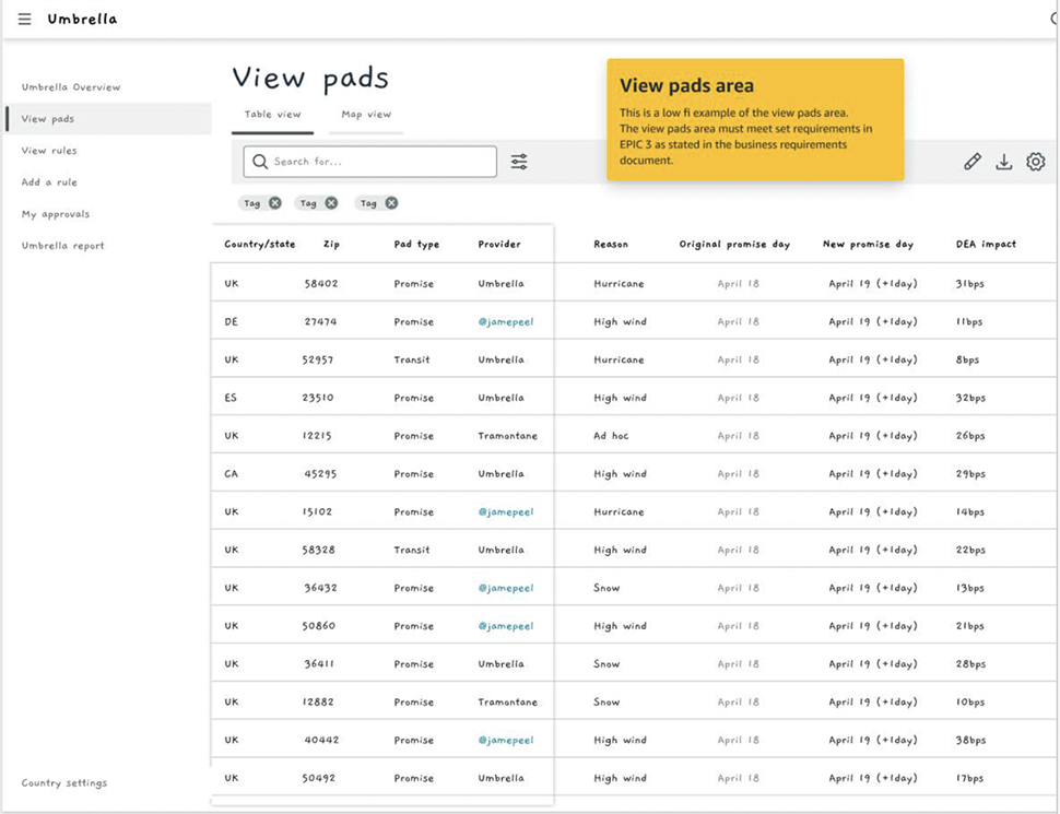
The wireframe: one impact column.
The shipped table: both sides of the trade, explanation one click away.
A unified solution deserved a unified language, so Umbrella is built on Meridian, the design system built for Amazon's transportation org. Most of the product is out-of-the-box Meridian - tables, forms, navigation, approvals - deliberately unexciting, so a tool people open mid-storm behaves exactly like the tools around it and nothing needs relearning.
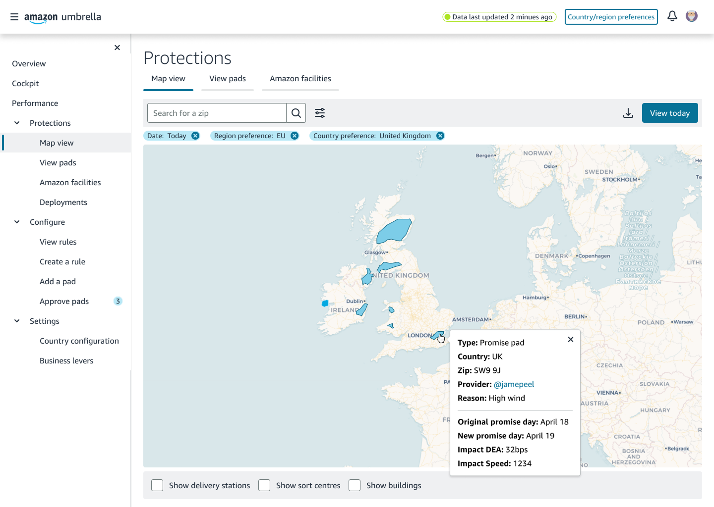
The gap was the map. Meridian had no map component, so we designed a new one for Umbrella and contributed it back to the system, for every transportation team after us. It's the component the protections map view and the draw-a-pad flow both run on.
Meridian: the design system built for Amazon's transportation org.
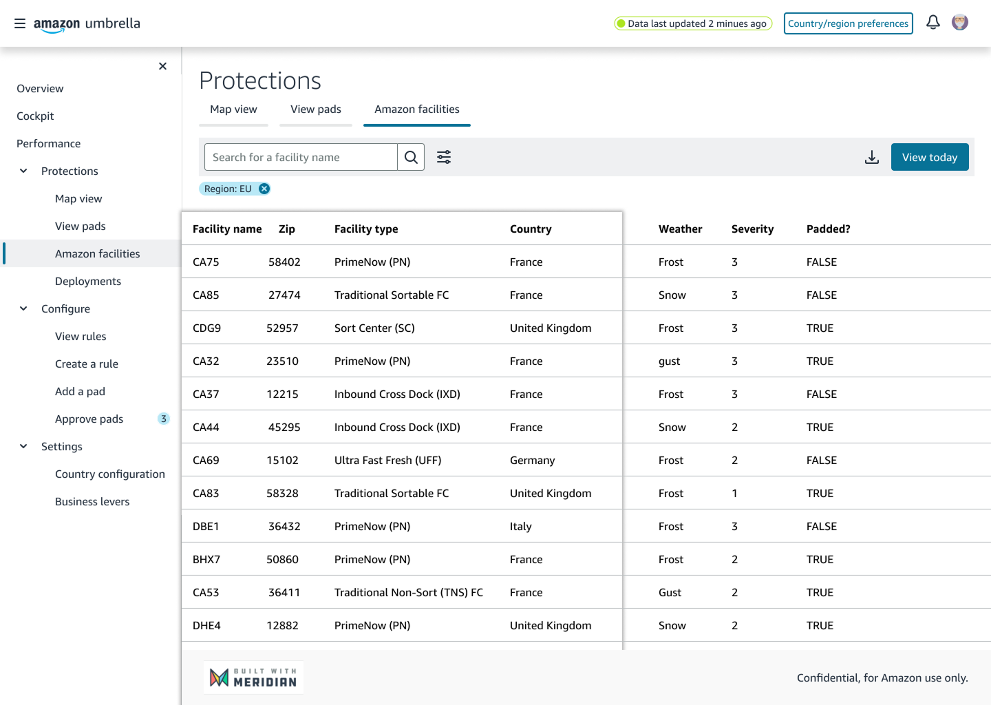
Standard Meridian throughout, and it says so on every screen.
Umbrella was the interface layer, not the model. What I own is that the programme became usable: a pad could be placed quickly, priced before it counted, and explained by name afterwards. And the operators said so: Umbrella scored SUS 84 with the same people who rated the old tools 58 and 47 - anything above 80 is an A grade.